
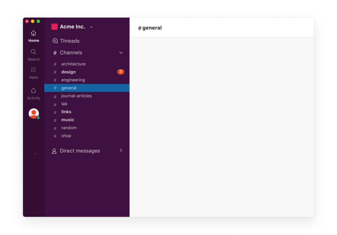
Today, we’re launching a significant update to Slack’s design. It’s not just one change, but a constellation of them—some shiny new things (channel sections!), some old things in new places and a general spring cleaning of information architecture.
These changes address a basic challenge that has grown naturally with Slack: with size comes complexity. As different product teams added new capabilities piecemeal, Slack started to feel not intuitive for people trying it out for the first time.
Our header alone had over a dozen places to click, and included two search bars:

And our menus were a bit sprawling:

Even people who had used Slack for years often didn’t know about powerful features because they were buried away in odd places. And this growing tangle made it harder for us to build new things; we couldn’t find places to put them.
This type of problem is hard to quantify and measure. We weren’t going to solve it through A/B testing tiny changes or intellectualizing over it in a room with a bunch of sticky notes. Instead, we took it to people in the real world.
We tried a new way of working with our users, bringing them into every stage of the design process. Together we were able to prototype, build and refine our designs to create a simpler and more organized Slack.
Assembling the team
We put together a small team of designers, engineers, researchers and product managers to create rough, “throw-away” prototypes. In the beginning, we put aside our previous ideas about what was essential in Slack. Because Slack’s mission is to make work easier for people, our guiding principle was to limit the choices someone using Slack might have to make. This meant stripping away as much of the interface as possible, and reorganizing it piece by piece.
The process was quick and dirty: We did our best not to hem and haw over details and minute decisions. This reductive approach led us to some very intriguing but untested prototypes.
While these seemed tidier, we wanted to make sure they were actually better: more obvious and useful for people trying to get things done in Slack. So we turned to customers for a gut check.
Co-designing with customers
In the early days of Slack, we were very similar to many of our users—tech-y people working at mid-sized companies. But these days people use Slack at all kinds of organizations and roles, from dairy farms and dentists to large retailers and banks. To make Slack simpler for everyone, we needed to hear from a broader group.
In order to collect feedback, we worked with customers the best way we knew how: through a shared channel. It was eventually shared with around 100 users from our champion network, representing dozens of organizations around the world.
The pilot channel provided a way for us to hear unfiltered input quickly. Their collective experience let us see where our first ideas weren’t quite right, and refine our design to improve the experience.
Among the many things we learned:
Member count is critical
As we attempted to strip down the UI, we thought that channel member count could be safely tucked behind a click. We figured it was extra noise that you didn’t need all the time.
In practice, member count provides a crucial sense of “reading the room,” which gives an important clue about how to behave.

After reducing our designs to almost nothing, we gradually rebuilt them to find a balance we felt was just right:

People will find the things they really want
When we introduced the ability to organize channels, we were concerned that people wouldn’t easily find out about it. At first, we added a big, top-level button.
However, we underestimated how much people actually wanted the capability. With just a bit of education, we saw members of the pilot learn to create custom sections despite the fact that it was tucked away.

History and navigation was best understood at the top of the app
This was the biggest departure from our previous interface, and it didn’t go without debate.

We found that people who work at large companies with lots of active conversations often rely on search or ⌘K to get around the app—much like a browser. Our horizontal hierarchy often left us struggling with the right placement for search. For the past year or so, we’ve had two different search inputs that do essentially the same thing. It wasn’t our favorite.
Our first prototype was controversial, and there was strong feedback from both sides.
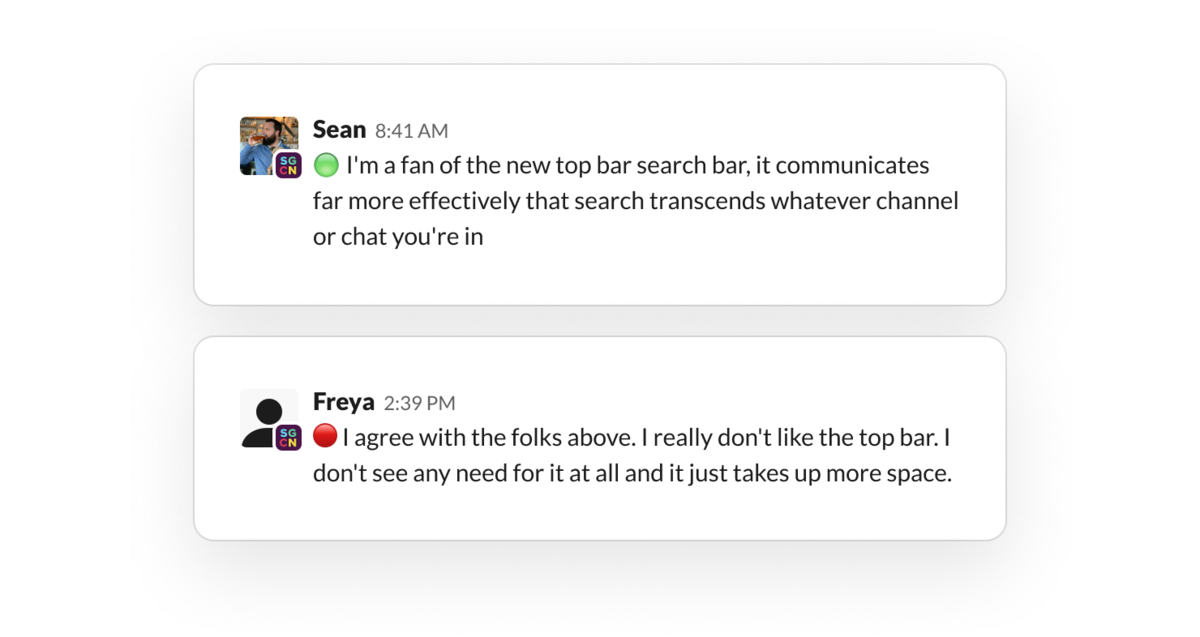
While this is a big change for Slack’s platform, it traded screen real estate for better matching the expectations of new and existing users alike. In the end, we gained a strong perspective: go for obvious over clever, and don’t reinvent the wheel.
Dialogue was crucial
Having everyone in a shared channel meant that, unlike a conventional pilot, we could have a free-form dialogue with people as they used it over weeks and months.

We learned from them, and they were able to build off each other.
In some cases, we were able to hear feedback and ship a new version within a day, to see if it felt any better. Collaborating in real time gave us a chance to co-design Slack with people who use it, and it made our work a lot better.
Learning from beginners

Even as things improved for established users, we needed to make sure Slack was genuinely easier for people just starting out.
We worked with our research team to run a “benchmarking” study that pitted the old Slack experience against the new one. For each version, we asked people who had never used Slack to complete a few important tasks, like sending a message, searching, and finding and joining channels.
In our first test, the results were mixed. While the new design beat the old one in a few categories, new insights popped up. To name a few:
Floating buttons definitively aren’t a thing on desktop
We tried to cleverly nestle our new compose button at the bottom of the sidebar. We thought it would stand out to new users, and provide a chance to match the design with mobile. But our participants completely ignored it. So we zapped it to the top of the sidebar, where people intuitively found and understood it.

Right-clicking on the desktop isn’t just for power users
In reality, it’s often the first or second thing people do to take an action. After seeing people trying to right click in testing (and getting feedback from our pilot), we created a more comprehensive design for right-clicking throughout the app.

Collapsible views should start open
In the new design, we brought important features like our people directory and saved messages into the top of the sidebar. To keep things minimal, we started with the view collapsed. But we quickly found that folks unfamiliar with the product were missing a big opportunity to learn about these capabilities. So we decided to start with them open for everyone.

After we worked through dozens of hiccups, our second test beat or tied the existing design. With that (along with similar studies with “average” Slack users) we felt more confident that what we were releasing was more useful, and easier to understand.
Getting the details just right
As the design came together, we left some time to polish some little bits and bops:
Our new save-a-message button does a fancy little boing when saving and unsaving. Cute!

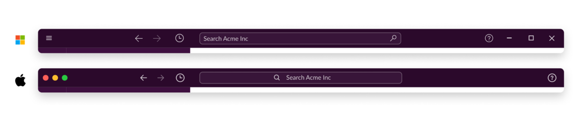
We refined our new top bar to feel a little more at home on Windows and Mac desktops.
Our various jump-to buttons now match one another.

We updated and expanded our set of built-in themes to take advantage of the new top bar for both the minimalist and the maximalist.

At Slack, we take design changes seriously. Because people are highly engaged on our platform, spending an average of nine hours every workday connected and around 90 minutes actively using it, we recognize that we need to be extra careful when making even the slightest change to their working environment. People choose to use Slack and we don’t take that for granted. Even the most well-intentioned changes to an app you use every day can leave you with the uncanny feeling that someone’s reorganized your room. Worse even, the adjustments can feel useless: change for change’s sake.
At the end of the day, we think this update takes us meaningfully toward a simpler, more organized Slack that will set the stage for more exciting improvements to come.
We hope you like it! ❤️
Anna Niess and Zack Sultan are designers at Slack. Interested in joining the team? We are hiring.
 Parfait !
Merci beaucoup pour votre feedback !
Bien compris !
Merci pour vos commentaires.
Oups ! Nous rencontrons quelques difficultés. Veuillez réessayer plus tard.