Most days, your work does not stay at your desk: You’re answering a quick DM between meetings, reviewing a deck on the train, checking in with your team from a client site, or catching up on a thread while you wait for coffee. When work follows you, the tools you use on your phone have to keep up. They need to be fast, clear, and feel like they belong on the device in your hand. This update focuses on helping you move through Slack more quickly in those short moments where you only have a few seconds to get something done.
You may notice these improvements as soon as you open the app. Navigation feels a bit smoother, key actions sit closer to your thumb, and the things you use most often appear faster. Even quick check-ins can feel easier, because the app is tuned more closely to how your day actually moves.
At Slack, when we make choices about layouts, controls, and interactions, we are thinking about how easily you can find the right channel, respond to your team, or jump into a canvas without losing momentum. Good design helps you manage your to-do list, collaborate in real-time, share files, or pull up the context you need, all from your phone. On mobile that means fewer taps, easier reachability and an experience that adapts to how people actually work throughout the day.
Our mission at Slack is to make people’s working lives simpler, more pleasant, and more productive. On mobile, that means supporting you wherever work happens. This is why we designed to implement Apple’s Liquid Glass experience for the Slack mobile app, now available on iOS 26. It brings more space for your content, smoother interactions, and a look and feel that fits right into the Apple ecosystem while still feeling unmistakably like Slack. The result is an app that feels lighter, quicker to use, and easier to navigate during those in-between moments where most mobile work happens.
A new era of iOS design
We care as much about how Slack feels to use as how it performs. iOS 26 and the Liquid Glass design system gave us a chance to tune the Slack experience so it feels right at home on your iPhone and iPad. From where things live on screen to how easily you can reach tools and information, our goal was to help you move through Slack faster on the device you rely on throughout your day.
What is Liquid Glass?
Liquid Glass is Apple’s new design language for iOS 26. It brings a fluid, glass-like interface with depth and responsiveness. Elements adjust to the context around them. Controls step back when you are focused and reappear when needed. This aligns closely with how we think about building Slack: clear, expressive, and thoughtfully constructed.
What we delivered in Slack for iOS 26
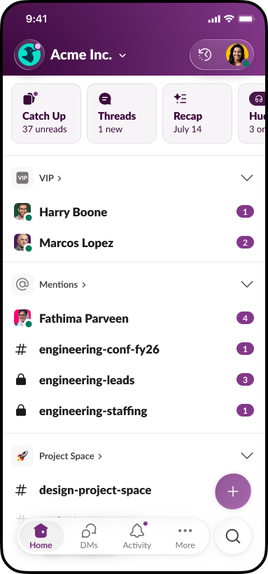
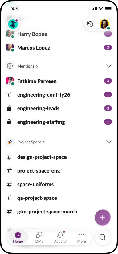
- 🔝 Extended content to reach the top and bottom vertical edges so your conversations and canvases use the full screen real estate
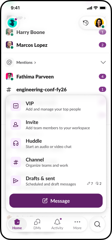
- 🧊 Glass treatments applied to navigation headers and floating controls for interactions that feel more expressive, delightful, and attuned to what you need while you work
- 📝 A redesigned composer with a new glass-capsule design that makes rich text inputs feel lighter and easier to use
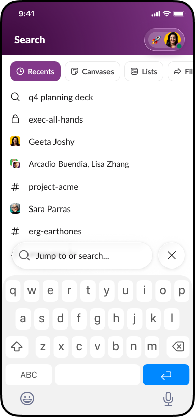
- 🔍 Floating search moved to the bottom navigation with a consistent glass treatment, making it easier to reach and faster to use
- 🧭 iPad windowing and menu bar support added for iPadOS 26 so users can move through Slack even more efficiently
Our iPhone and iPad users choose Apple’s ecosystem for its quality, polish, and seamlessness. They expect applications to feel intuitive and thoughtfully designed. You’ll notice Slack feels like it belongs on iOS 26, while still feeling like Slack.
Built for how you work
Designing for iOS is not only about adopting a new look. It is about supporting the way people actually work on their phones. Most mobile work happens in motion: answering a DM in the hallway, reviewing a doc while on the road, checking in with your team between customer meetings. Speed and clarity matter most. You need to find what you’re looking for quickly, respond without friction, and stay in the flow. We shaped this update around real mobile habits: one-handed navigation, quick glances, fast replies, and short bursts of focused work.
You will recognize familiar Slack elements, such as themes, expressive interfaces, emoji, and a friendly tone, remain. Liquid Glass frames them in a way that feels natural to iOS, with controls that only appear when needed. The experience stays familiar but now feels easier to use when you are juggling multiple tasks or moving through your day.
By relying on Apple’s native components, our teams spend less time rebuilding the basics and more time refining the moments that matter: writing a message, finding what you need, sharing a file, jumping into a canvas, or catching up on a thread. The result is less friction, more flow, and an app that feels intuitive from the moment you open it.
Every improvement supports faster, more confident action on mobile, whether you are clearing out quick tasks or preparing for something more important.
Search anything, wherever you are
Mobile work often happens in small windows of time, and searching for information in those moments needs to feel instant and effortless. When you are walking into a customer meeting, riding between sites, or jumping between conference rooms, you rarely have time to click through menus or remember exactly where something lives. You want to ask, “What was the last escalation for Acme?” or “Summarize today’s incident channel,” and get an answer right away. This update focuses on giving you that speed when you only have seconds to get caught up.
With iOS 26 moving the global search control to the bottom of the screen, we brought Slack search into that same thumb-friendly zone. One tap opens up your work. The next time you’re looking for an answer while you’re walking, you’ll notice you can pull up the important context you need without slowing down.
Slack Enterprise Search brings everything your company knows into one place. Messages, canvases, files, customer records, and data from connected apps form a unified, permission-aware knowledge base. The more your team works in Slack, the richer that corpus becomes, and the easier it is to ask a natural language question and instantly find the message, file, or system record you need. For mobile-first workers, this eliminates the scavenger hunt and gives you the information you need exactly when you need it.
Search in Slack goes beyond finding old messages. It is the entry point into your work: channels, DMs, canvases, files and your AI tools. By putting Enterprise Search in a dedicated bottom tab, we are setting things up so that with one tap you can ask Slackbot or another agent to surface the right thread, summarize a discussion, or spin up a canvas to prep for a meeting. The result is a mobile workflow that delivers immediacy: ask a question, get context, take action, and move forward.
Looking ahead
Early feedback has been encouraging. Customers have told us Slack feels “at home” on iOS 26 and fits more naturally into how they already use their iPhone and iPad. That is the experience we aimed to build: an enterprise-grade work app that feels native to iOS while still unmistakably Slack.
This foundation is already shaping what comes next. The new design system gives us the flexibility to unlock things like landscape support (coming soon) so you can take advantage of wider layouts with more room for content. It also positions us to deliver easier, more consistent access to AI agents across the app. These updates help us move faster toward Slack as the agentic work operating system, giving our customers a mobile experience with answers and actions always close at hand.
We are proud to work with Apple on this next step and even more proud to bring a new era of Slack to the devices our users love most.
Ready to try it?
Update Slack on your iPhone or iPad to get the new iOS 26 experience.
Open the app, tap around, and try:
- Sending a few messages with the updated composer
- Searching from the bottom tab to prep for your next meeting
- Browsing your favorite channels and canvases in the new layout
 Fantastico!
Grazie mille per il feedback!
Capito!
Grazie per il feedback!
Ops! Si è verificato un problema. Riprova più tardi.