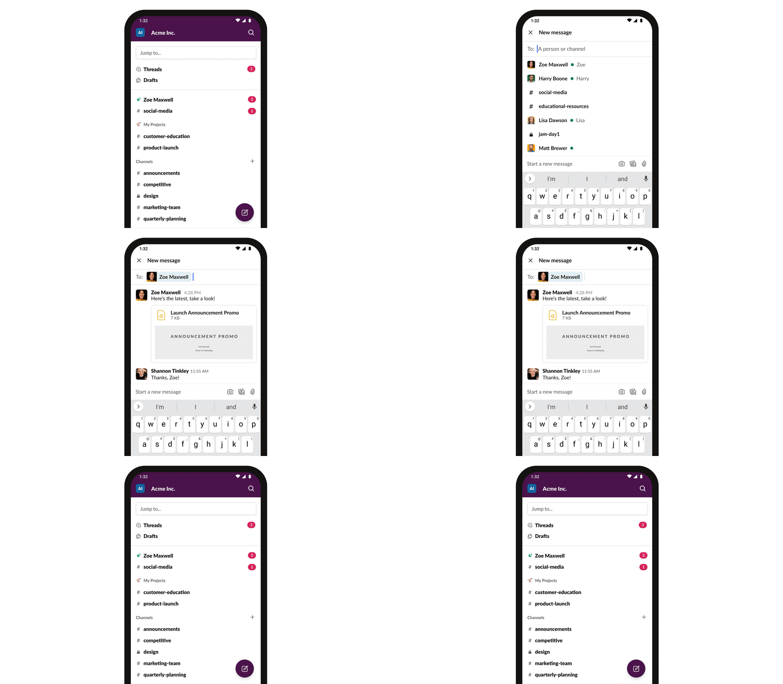
Today we begin rolling out a new design for Slack’s iPhone and Android apps. This update introduces improved navigation, quick access to set your availability and status on the go, an easy-to-reach compose experience, and shortcuts to your apps and workflows.
You can get the changes by updating to the latest version in the Apple App Store or Google Play Store. The update will be coming to everyone over the next week.
We recently launched a significant update to Slack’s design on desktop. The changes were aimed at addressing problems with the usability and discoverability of some core features of the Slack experience. Before the redesign, we had inconsistent entry points and complex menus. Certain features were buried away and underutilized, making Slack harder to learn and use than it should be. The update improved these issues and introduced powerful features to organize your sidebar and work with apps using shortcuts.
Of course, our desktop app is only one way to use Slack. Slack on mobile is an essential tool for collaborating with your team while you are away from your desk, especially as people adjust to working remotely and develop new habits for collaborating with their teams. In parallel with our efforts on desktop, we have been rethinking our mobile apps to make them easier to navigate and optimized for using Slack on the go: quickly catching up, responding to DMs and mentions, sending messages, and getting work done with the shortcuts feature. We arrived at this design through a process of user research, iteration, and feedback from participants in our Champions network.
Today we begin rolling out the result of those efforts—a simpler, more organized Slack for your phone. Here’s an overview of what we’ve updated and some key things we learned along the way.
Tabs provide quick access to what you need
Great mobile designs aren’t achieved by just creating smaller versions of desktop apps. With this redesign, we re-examined the core use cases for Slack on mobile and arrived at a navigation design that is optimized for using Slack on the go. Through this process, one thing became clear—that entry points to the most important screens need to be at the top level of the app’s navigation. Our previous navigation system was confusing and unconventional. We went back to basics to provide a navigation experience that most mobile users will expect: a tab bar.

Home: check in on your conversations
The first tab is where our users start: It’s Home, a list of your conversations. Channels and direct messages that need your attention right away bubble to the top of the list, while all your other channels and unread conversations are organized in your sections below.
Direct messages
We know our users love using direct messages to communicate. Previously, your list of DMs was hard to reach on mobile. On iPhone, it was accessed via a lesser-known swipe gesture on the sidebar; on Android, via a dropdown from the sidebar. Both versions suffered from lack of discoverability, making the feature harder to use than it should be. Bringing recent conversations to the new tab bar as a dedicated list of your DMs makes getting back to your one-on-one and small group conversations much easier.

Mentions and reactions help you to catch up
During our testing phase, we surfaced what was previously the “Activity” screen to a more prominent location in the app and named it “Mentions and reactions.” This was based on learning from a similar exercise during our desktop redesign, which brought this entry point into the sidebar. We kept this treatment on mobile for a few weeks to get feedback before trying a different placement.
Immediately on making the change, we received strong feedback from our testers that Mentions and reactions had quickly become a core part of their daily usage patterns and had significantly improved their work on mobile. Being able to rapidly see all your mentions in one place lets you follow up quickly. Updates on reactions to your messages helps move your work forward as you see your colleagues’ 👀, 👍 and ✅s arrive.

You, and your availability
Managing your status while away from your desk has always been important, and even more so as we adjust to the new challenges of working remotely. People are constantly context switching and need a way to keep their team informed of their availability. Our previous design placed these controls in a menu that was hard to discover and easy to forget. Bringing You to the tab bar allows you to update your status, set yourself to away, snooze your notifications, and access your preferences from the top level of the app.

Quick gestures to navigate
You’re probably often using your mobile phone with one hand. Maybe you’re holding a child on your hip, carrying a laptop, or stirring the soup. We all multitask while on our phones, and we’ve designed swipe gestures that let you easily navigate between screens when doing so. (Of course, all actions that are available via swipe gesture are also accessible by visible onscreen buttons.)
From any tab, swipe right to open a list of your workspaces or swipe left to get back to your last conversation. When in a conversation, swipe right to get back to your last tab.

Fast and focused communication
We wanted to make it as simple as possible to start a new conversation, post a quick message, or hop on a call. Following the release of the compose button on desktop, we’re bringing it to mobile. This lets you start a new conversation or send a message to an existing one without having to first find that conversation in your channel or DMs list.
We’ve also made the Call button just one tap away in DMs and group DMs so you can jump on a call with your colleagues when away from your desk.

Work with apps in Slack using shortcuts
Apps connect your tools to Slack so your team can work together more efficiently. Some apps include shortcuts that you can use to take actions in another service without leaving Slack. This makes it easier than ever to take actions in Slack, like initiating a call, setting a reminder or creating a poll. To get started, just tap the lightning bolt below the input bar. ⚡
Looking ahead
We’ll continue to incorporate what we learn through research and our Champions network to make Slack even better for mobile; this redesign sets the stage for more improvements to come. Let us know what you think by using the in-app “Send feedback” button under Preferences. We’d love to hear from you.
Interested in joining the team? We are hiring.


